
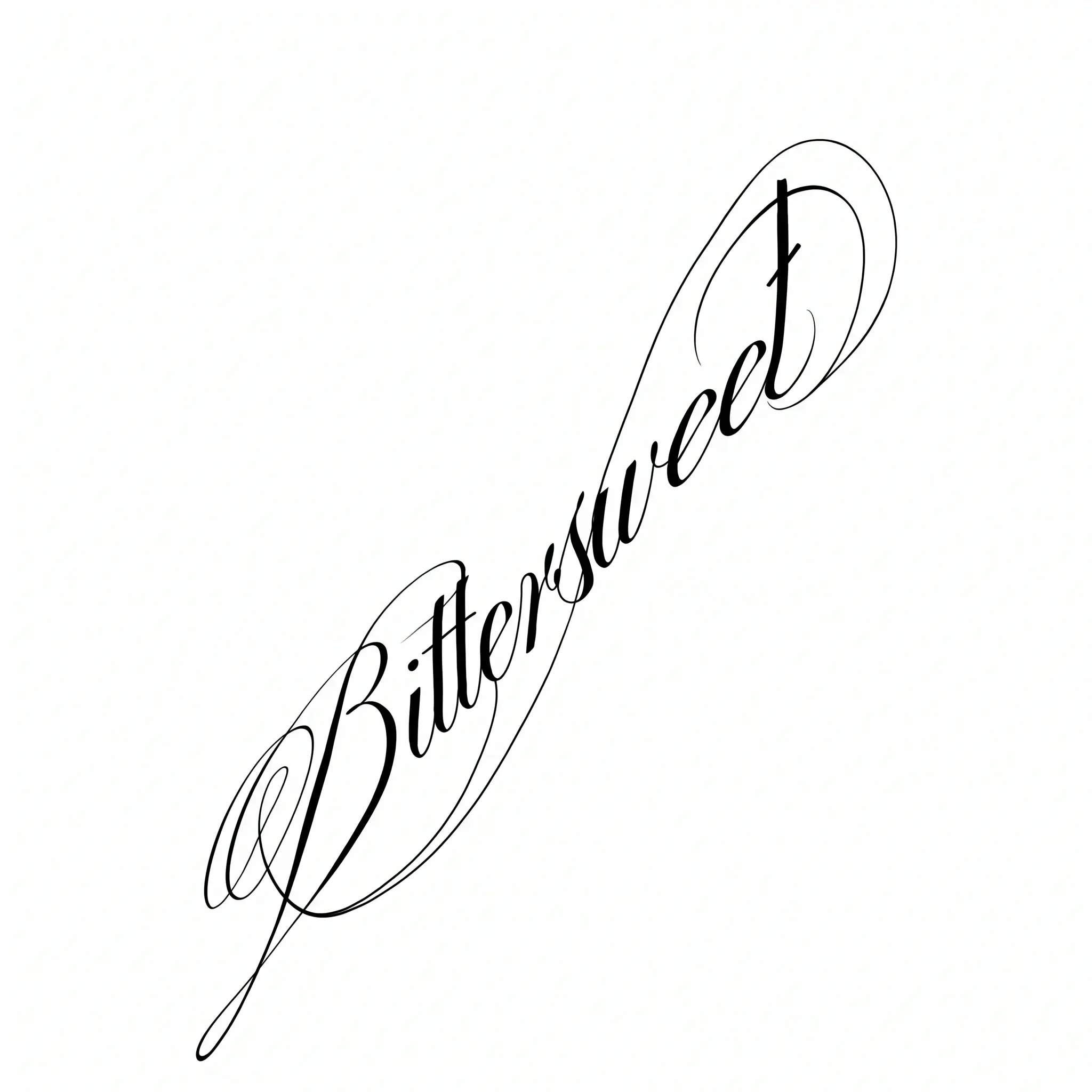
What Is a Lettering Tattoo?
A lettering tattoo makes written language the main image. Its design depends on more than choosing a font: letterforms, stroke logic, spacing, baseline, line breaks, hierarchy, and placement all have to work together for the exact text.
Script is one family within Lettering, not a synonym for the whole category. Lettering can also be Gothic, Chicano, serif, sans serif, typewriter-inspired, or adapted from personal handwriting.
A digital font can communicate a direction, but the final composition should be redrawn and proofed for the specific phrase and body placement. Both Monolith Studio’s Lettering overview and Milly Tattoo’s practitioner guide emphasize custom composition rather than treating a font sample as a finished tattoo.
Why Lettering Can Feel So Personal
Lettering can state something directly rather than represent it through a symbol: a name, date, promise, place, memorial phrase, or private reminder. The meaning already exists in the words; the lettering gives those words a visual voice.
The same phrase can feel intimate in loose handwriting, formal in Roman capitals, forceful in blackletter, or restrained in a clean sans serif. Personal does not have to mean ornate—the strongest direction is the one that supports both meaning and reading.
The body becomes part of the layout. A forearm offers a different axis from a wrist, rib, collarbone, or chest, so placement can change the baseline, line breaks, orientation, and natural reading distance. Typographic tattoo interviews collected by MyFonts describe this relationship between letterform and body placement.
Match the Lettering Style to the Words
Start with the text, not the font. Decide whether the words should feel intimate, formal, forceful, restrained, heritage-led, or unmistakably handwritten—then test that direction at the intended physical scale.
Short words can support denser structures, while longer phrases usually need simpler letterforms, more open spacing, or deliberate line breaks. The specific letters matter too: repeated joins, ornate capitals, punctuation, and narrow counters can change which direction remains readable.
Choose a Lettering Direction
Compare the visual voice, suitable text, and weak points before treating any font as a final answer.
Script & Calligraphy
Flowing, intimate, or formal handwritten movement.
Works well for
Names, vows, and intimate short phrases.
Watch
Loops, joins, steep slants, and flourishes need room.
Gothic & Blackletter
Dense, historic, formal, and visually forceful.
Works well for
Strong single words, names, and short statements.
Watch
Narrow counters and ornate capitals usually need more scale.
Chicano Lettering
Expressive script, ornamental rhythm, shading, and cultural history.
Works well for
Family, memorial, identity, and personal statements.
Watch
It is a complete visual tradition, not merely a downloadable font.
Serif & Roman
Classical, editorial, architectural, or formal.
Works well for
Dates, literary phrases, and text that needs formal clarity.
Watch
Fine serifs and stroke contrast must remain visible.
Sans Serif & Minimal
Clean, direct, restrained, and contemporary.
Works well for
Coordinates, initials, dates, and direct short words.
Watch
Minimal does not mean as small as possible.
Typewriter
Literary, archival, mechanical, and slightly irregular.
Works well for
Quotes, dates, coordinates, and archival references.
Watch
Long copy and uniform spacing can become crowded quickly.
Personal Handwriting
Intimate, unique, imperfect, and tied to a real person.
Works well for
Notes, signatures, memorial handwriting, and family messages.
Watch
Preserve character while cleaning paper noise and weak overlaps.
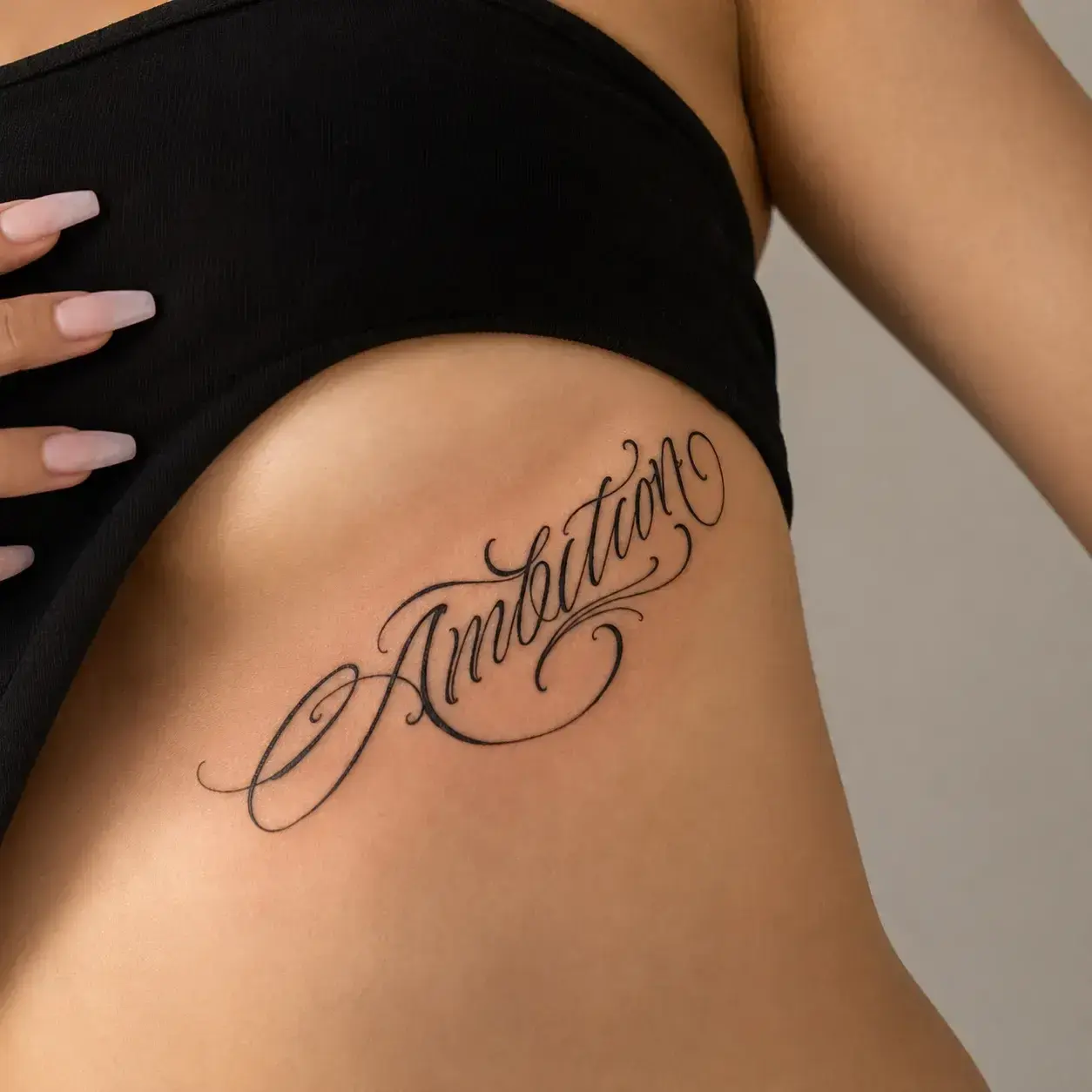
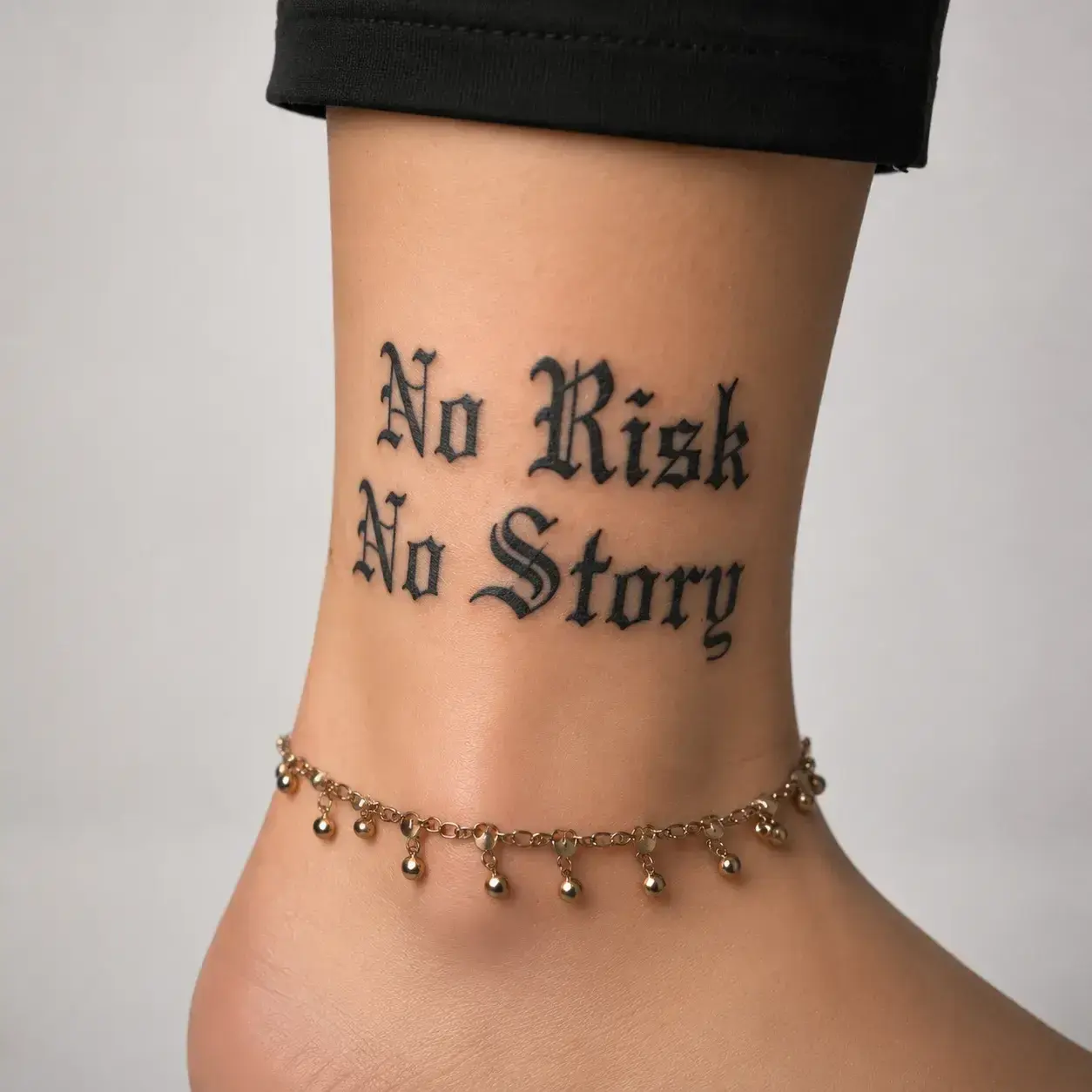
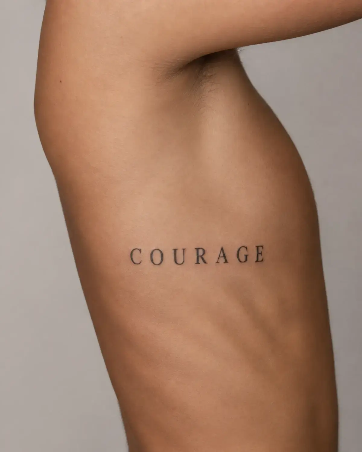
Lettering Tattoo Ideas in Practice
Compare how open joins, counter space, stroke weight, and body flow change across three lettering directions.
What Can Make Lettering Hard to Read
Exact text comes first. Keep one plain-text master containing the intended capitalization, apostrophes, accents, punctuation, numbers, and line breaks. Compare every styled version with that master, and have another language checked by a competent translator or fluent speaker before layout begins.
There is no universal safest font or minimum size. Thin joins, narrow counters, tight letter pairs, dense capitals, and long lines all need enough room at the intended scale. Check the design at actual size and from a normal viewing distance, then let the artist simplify or open the spacing where necessary. Milly Tattoo and tattoo artists interviewed by Allure both emphasize judging the specific wording, placement, and artist’s healed work rather than relying on one universal font rule.
A flat sample cannot fully represent a wrist curve, rib line, vertical orientation, or wraparound placement. Position and photograph the final stencil, check which end reads first, and repeat the complete proof after any wording or layout change.
Under US Copyright Office guidance, names and short phrases are generally not protected by copyright, but longer quoted material and song lyrics can be protected, while names or phrases may raise trademark questions. Use source text responsibly and obtain professional advice when rights are unclear. This page provides general information, not legal advice. US Copyright Office
Lettering with Related Tattoo Styles
Lettering describes text as the main subject. Fine Line, Chicano, and Minimalist can change how that text is drawn, but each adds a different design logic and set of expectations.
Lettering + Fine Line
Dimension
Defines
Lettering
The exact words, letterforms, spacing, and reading order.
Fine Line
A lighter line approach or delicate supporting illustration.
Dimension
Works when
Lettering
The words remain the main subject.
Fine Line
The design needs a quieter weight or restrained ornament.
Dimension
Do not assume
Lettering
A beautiful font solves physical readability.
Fine Line
Fine lines make cramped or tiny text safer.
The combination can feel light and personal, but Fine Line does not remove the need for readable spacing and scale.
Lettering + Chicano
Dimension
Core
Lettering
Accurate text organized as the central visual subject.
Chicano
A historically rooted visual language of script, composition, ornament, and shading.
Dimension
Artist fit
Lettering
Strong control of typography and exact text.
Chicano
Relevant Chicano lettering knowledge and healed work.
Dimension
Avoid
Lettering
Using ornament that obscures the wording.
Chicano
Reducing a cultural visual tradition to an Old English font preset.
Choose a specialist when the design depends on Chicano lettering rather than borrowing the look as a generic font effect.
Lettering + Minimalist
Dimension
Priority
Lettering
Preserve the exact words and a coherent letter system.
Minimalist
Remove decoration and secondary hierarchy.
Dimension
Best for
Lettering
Names, dates, coordinates, and direct short phrases.
Minimalist
Ideas that gain strength from restraint and open space.
Dimension
Risk
Lettering
Over-thinning characters or punctuation.
Minimalist
Treating minimal as permission to make the tattoo extremely small.
Minimalist lettering should reduce noise, not reduce the text below a readable physical scale.
Build a Lettering Tattoo That Still Reads
1. Lock the master text. Confirm every character, number, punctuation mark, capital letter, accent, and intended line break before decorative styling begins.
2. Choose a direction, not a finished font. Explain whether you want formal structure, soft movement, heavy contrast, plain clarity, or the rhythm of real handwriting.
3. Fit the composition to the body. Decide the placement, reading axis, approximate physical size, orientation, and whether the text needs one line or several.
4. Proof character by character. Compare the styled version with the plain-text master and inspect it at the intended physical size instead of only zooming into a screen.
5. Review the positioned stencil. Confirm the first reading direction, baseline, curvature, spacing, and normal-distance readability on the body. Any wording or layout change should restart the complete proof.
6. Choose relevant artist evidence. Look for healed lettering with similar stroke weight, size, density, and placement—not only fresh close-up photographs.
Lettering Tattoo FAQ
Short answers to common questions before you generate or bring a reference to an artist.
Is a lettering tattoo the same as a script tattoo?
No. Script is one lettering family built around handwritten or calligraphic movement. Lettering also includes blackletter, Chicano, serif, sans serif, typewriter-inspired, and personal handwriting directions.
What is the best font for a lettering tattoo?
There is no single best font. The exact letters, text length, placement, physical size, and intended voice determine which structure is most workable.
How small can a lettering tattoo be?
There is no universal minimum. The smallest counters, joins, punctuation, and spaces still need to read at the final position and scale, so ask the artist to test the exact wording rather than follow a generic number.
Can personal handwriting be used for a tattoo?
Often, yes. An artist may need to remove paper noise, strengthen weak overlaps, or adjust spacing while preserving the rhythm and irregularities that make the handwriting recognizable.
How should another language or Roman numerals be checked?
Keep ordinary numbers beside any Roman-numeral version, and ask a competent translator or fluent speaker to verify every character before decorative styling begins.
Can I tattoo a lyric or quotation?
Lyrics and longer quoted text can be protected by copyright, and names or phrases may raise trademark issues. Use source text responsibly and seek permission or professional advice when rights are unclear.
Is a generated lettering preview ready to tattoo?
No. Use it to compare visual directions and communicate with an artist. The final letterforms, layout, size, placement, and stencil must be reviewed and adapted by the tattoo artist.